OphthoGenie
Learning Management System (LMS) for Ophthalmologists
One-of-its-kind app for learning through oral prompts
Founded by ophthalmologists Kendra Klein & Nora Muakkassa, OphthoGenie provides students studying for their Oral Board Exams with comprehensive, high-yield, up-to-date cases using an innovative study method. Klein & Muakkassa developed OpthoGenie when studying for their own Oral Board Exams.
OphthoGenie is now a one-of-its-kind robust Learning Management System built for Ophthalmologists to study smarter and stress less for their American Board of Ophthalmology’s Oral Board Exam.
What We Did
- Product Research
- Development Roadmap
- User Experience Design
- User Interface Design
- Database Architecture
- API Integrations
- Web Development
- User Surveys
- CI/CD Pipeline
- Marketing Collateral
Application Tech Stack
The Objectives
Make it Simple, Make it Scalable.
Nora and Kendra approached us with an early-stage idea of digitizing their PowerPoint Slide Deck into a Digital Learning Platform for fellow Ophthalmologists to practice for American Board of Ophthalmology (ABO) Oral Boards. The initial idea was a simple one: convert the Slide Deck to Digital Flashcards, which would have provided little to no additional value to end-users.
During our Product Development Workshop we identified several Product Roadmaps and functionalities that would lead to a functional and usable tool for Ophthalmologists studying for the test. Quickly the idea turned to solving the larger challenge of facilitating test-takers' study and track performance metrics for an Oral test.
The Solution
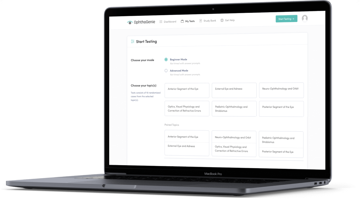
Learning Management System (LMS) with data visualization and guided training.
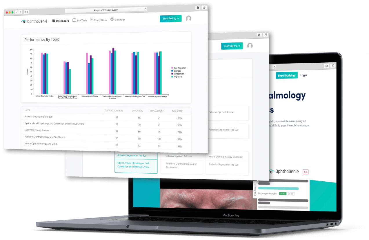
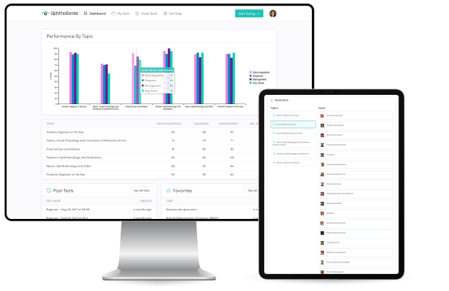
State-of-the-art LMS built for oral boards prep with testing simulations, bi-directional collaboration experience, performance metrics visualization, and question bank management. Hosted on cloud architecture with multiple modes for studying, grading, testing, and results analysis.
From Google Slides to a fully-functional web application. Made by Ophthalmologists, for Ophthalmologists (and crafted by AKOS).
Study Buddy
We’d like to commend ourselves for thinking of this pre-pandemic. High fives for creative foresight!
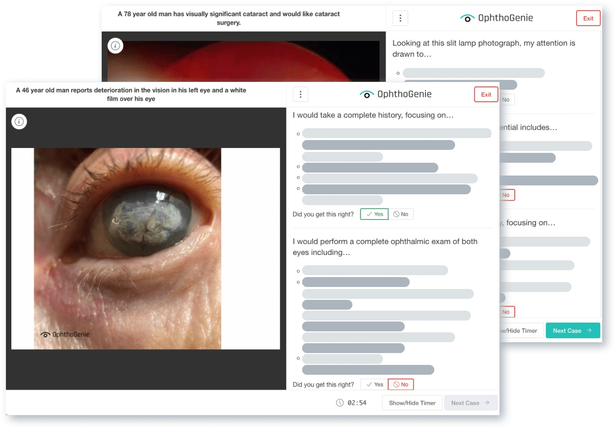
As an x-factor for our product, we wanted the ability for a test-taker to ask friend (a study buddy) to grade their verbal answers. The traditional Zoom screen-share would wasn’t ideal, because the test-taker and their study buddy needed different views on their screens, respectively. We relied on Pusher’s bi-directional hosted API to create synced, but separate, realtime experiences for both users. Test-takers view was limited to reviewing case question, images, and prompts; whereas Study-buddy view could see answer prompts, step-by-step answers, grading criteria, and image previews.

Stripe Payments
Data Analysis
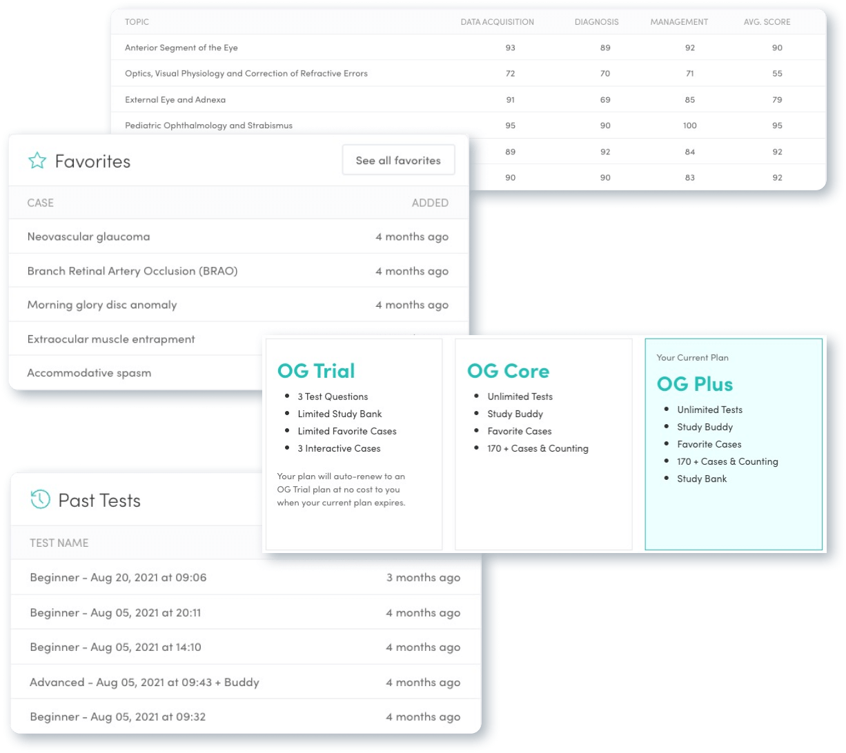
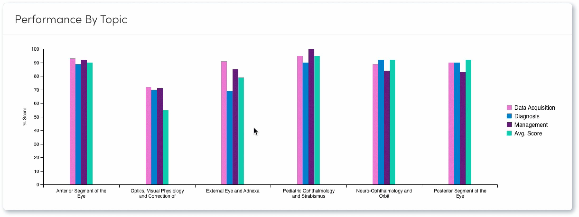
Effective test-readiness requires measuring progress. Oral Boards are comprised of 6 topics and test-taker is analyzed based on 3 scoring categories: Data Acquisition, Diagnosis, and Case Management. A Test-taker can initialize a test for any single topic or one of the three approved paired topics. While creating our database architecture, we built systems to tag each Case Answer Element to a scoring category. On test completion, we’re able to analyze performance in all three scoring categories and their to present to the Test-taker, along with the ability to review each case and their responses. Additionally, the Test-taker is also presented with aggregate performance metrics on their dashboard across all 6 Topics and 4 data points for tracking their test-readiness.
Marketing Website
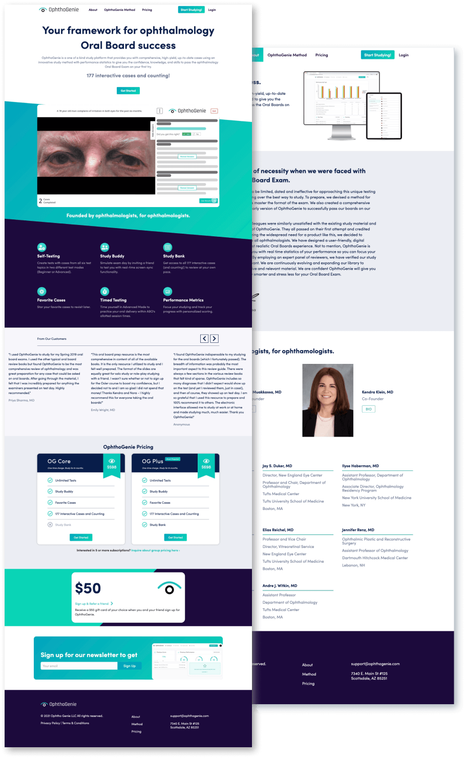
Built on WordPress open-sourced CMS, the OphthoGenie marketing website is the destination for all marketing, partnership, and outreach efforts. With an evolving product, the website needed to be easily editable for Nora and Kendra, while promoting the unique capabilities of OphthoGenie as an American Board of Ophthalmology’s Oral Board preparation solution. We achieved our goals by building the site framework using custom Wordpress theme using Beaver Builder, a product walkthrough video, and FAQ accordions.

Colors
The cool & calming color palette was developed for OphthoGenie to bring a calmness to the web application. After all, studying for an exam can be stressful enough. We wanted users to feel at ease when studying on the platform.
Typography
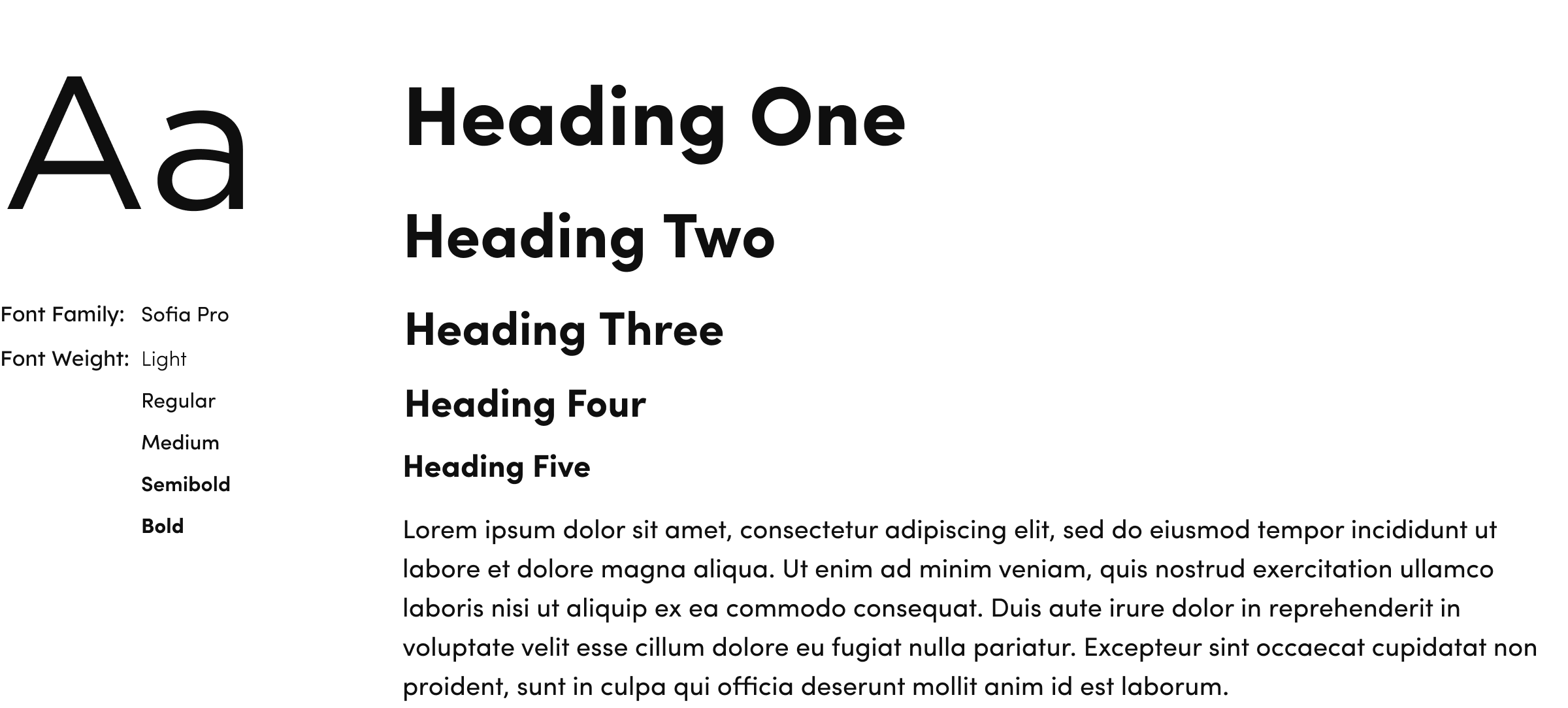
We chose Sofia Pro for the web applications font for its modern, friendly look. The familiarity evoked by the font gives users trust in the brand, providing users peace of mind and confidence when studying for their oral board exams.
Logo
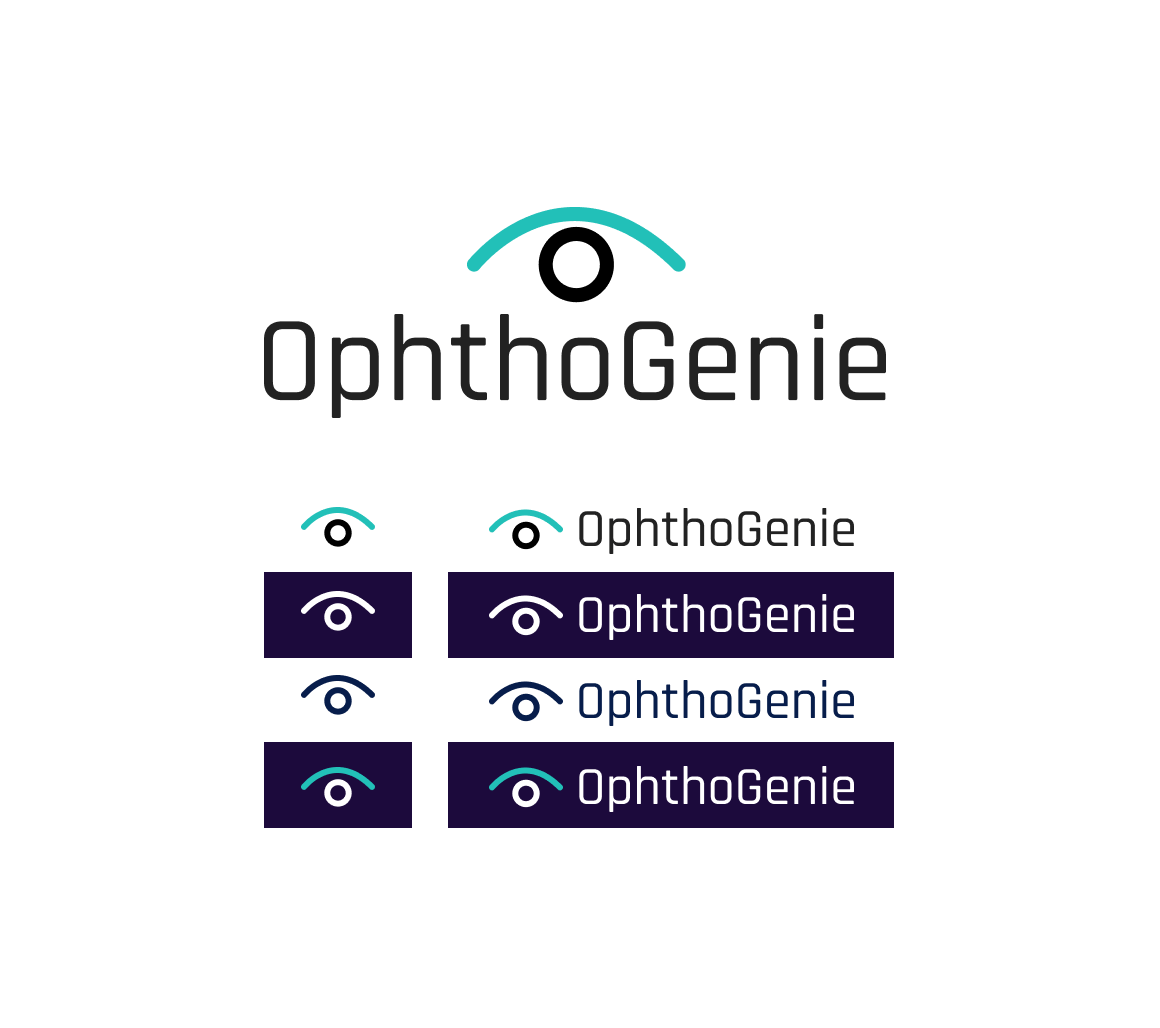
For the logo, we worked with the client team to devise something clean that spoke to the new brand descriptors and feels we wanted people to have when coming into contact with the brand.
Descriptors: Scientific, Inventive, Open, Authoritative, Transparent
Feels: Sophisticated, Beautiful, Confident
Consult Our Experts
Outdated portals and communications platforms can lead to industry-wide disconnect and lost opportunities. Let’s talk about how AKOS can help you, and your entire industry, move into the future with confidence.
